Overview
We touched a little bit on the sail performance charts on the Reviewing Data section of this User Guide. That section talks about looking at the data for the sails at the session level. But we can also look at the data aggregated to boat level. So we see all of the data we hold for a given sail or sails.
Follow the steps below to review.
- On the Session List Panel click the Manage Boats button.
- Select the boat that you want to review Sail Data for.
- Select the Sail Data tab.
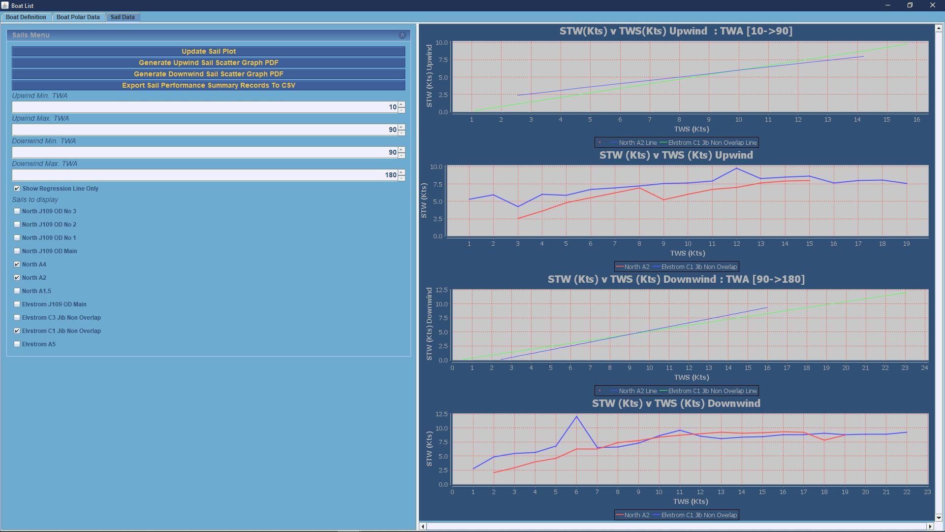
This will bring up a screen like the one on the right,
The display on the smaller Rockit Server Device screen will be more or less identical to the Desktop view.
The list of sails displayed will match those in the Boats configuration. Its worth noting that just because there is a entry in the cheque list for a sail doesn’t mean any data will have been collected against it.
Plotting Regression Lines
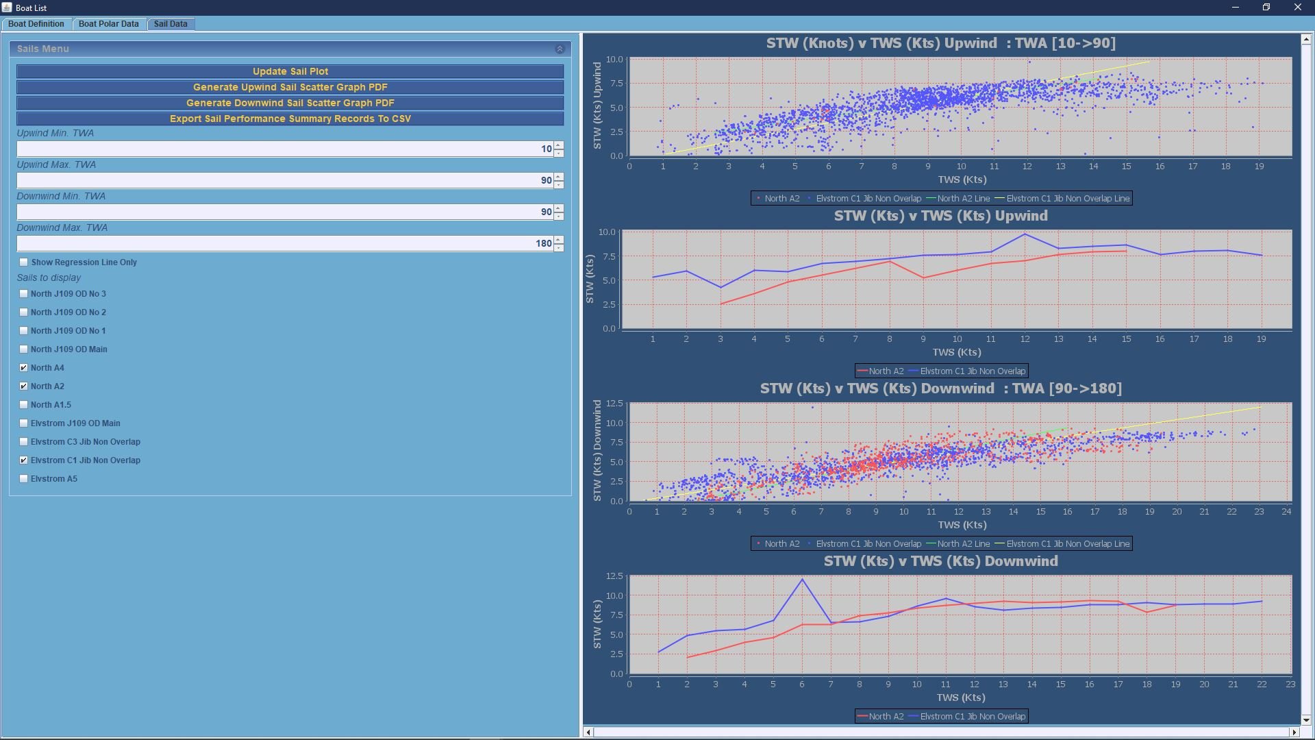
The next screen shot shows the default view of the data.
The sails to be plotted are selected by checking the check box in the list on the left.
Rockit looks at the boat speed through the water in the timeslots where the wind speed and wind angle match.
Rockit will plot the collected data in 4 graphs.
- A regression line for sails data points between 10 and 90 degrees to the true wind angle. This default view will pick up all up wind data and plot the regression line based on the wind angle and wind speed.
- A plot of the average boat speed for the given wind angle range between 10 and 90 degrees true is the default effectively upwind. This view finds all the timeslot records where the TWA and TWS are within the required range and averages out the results. The resulting averages are then plotted.
- A regression line for sails data points between 90 and 180 degrees to the true wind angle. This default view will pick up all down wind data and plot the regression line based on the wind angle and wind speed.
- A plot of the average boat speed for the given wind angle range between 90 and 180 degrees true is the default effectively down wind. This view finds all the timeslot records where the TWA and TWS are within the required range and averages out the results. The resulting averages are then plotted.
Only data points will be plotted where there is actual data. Rockit won’t estimate any missing data points so the regression lines may not go the whole way across the graph.
We can start to see some of the patterns in the data.
- The North A4 has never been used – or at least we don’t have any data. If we think there should be we can use the bulk edit functionality on the Session Data Display screen to correct that.
- Not surprisingly the Elvstrom C1 Jib is faster than the North A2 spinnaker upwind and the reverse downwind. Though this is clearer in the averages plot than in the regression plot. In fact the suggestion from the Regression plot (1st and 3rd graphs) is that the A2 might be faster than the C1 in very light winds upwind and the reverse downwind.
Which seems unlikely ……
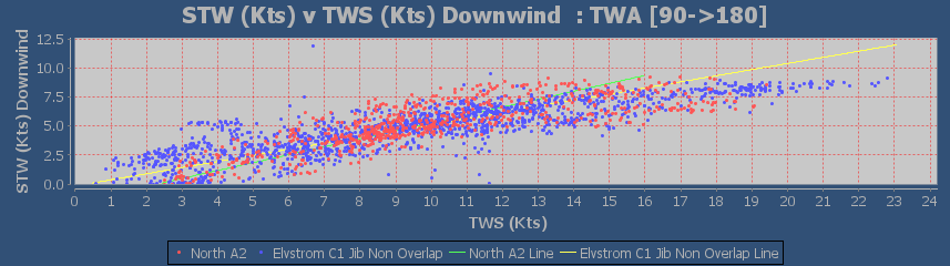
 Displaying The Actual Data Points For A Sail Data Plot
In the example on the right this shows us a couple of things.
On the top graph we have a lot of blue points (C1 Jib) and hardly any red ones (A2 Spinnaker) which makes sense if we are looking at an upwind graph. It shows us that the regression lines are being distorted by a couple of outlying values for the A2 spinnaker.
On the 3rd graph we can see the red and green dots are more evening spread. Red is the A2 Blue is the C1. But in the mid section 7 to 15 knots TWS the red dots tend to be associated with a higher boat speed. There are a few outlying blue dots that will have influenced the averages in the lower graph.
But we can say with a fair degree of certainty that the C1 is faster upwind and the A2 downwind.
The question though is at what wind angle do they swap around ?
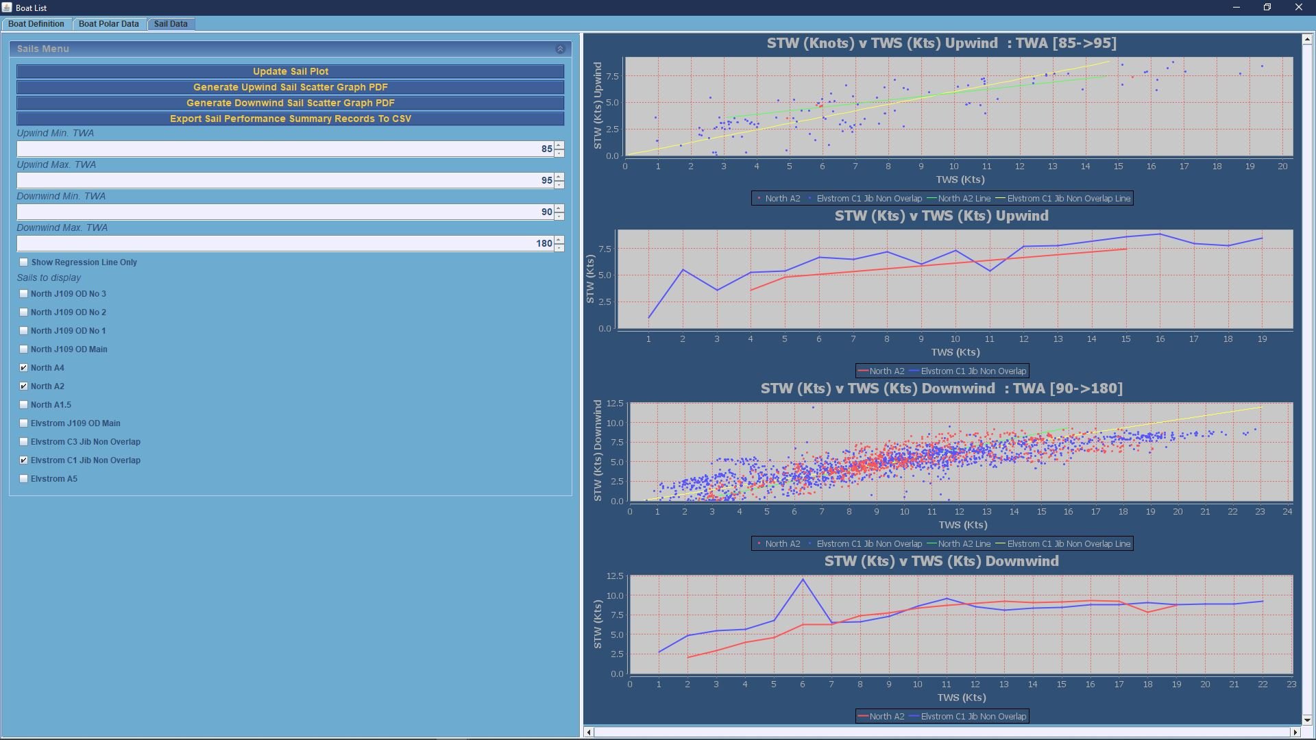
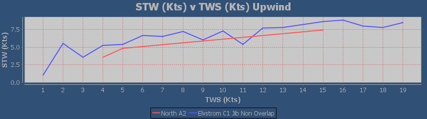
Plotting Sail Data For A Specific Wind Range
If we want to really understand the performance of the sails we can narrow the wind angle down.
Suppose we know that we are going to be sailing a course that is roughly 90 degrees to the true wind angle at between 7 and 10 knots. Which sail should we pick ?
We can set the Maximum and Minimum wind angles for the two sets of graphs using the fields on the left control panel.
We actually only need to change one pair of data points to answer our question. We set the Upwind Min angle to 85 degrees and the Upwind Max angle to 95 to cover the points around our expected average angle allowing for shifts in the wind of 90 degrees true. Remember this is the true wind angle relative to the boat. Not the True Wind Direction relative to North.
We can then press the Update Sails Plot panel to refresh the graphs.
The result on the right shows that the C1 is probably going to be faster than the A2 – certainly based on the second graph of averages. The Blue Line (c1) on the second graph is above the Red (A2) line.
Which makes sense if you think about it. 10knots wind, 6.5knots boat speed at an True Wind Angle of 90degrees is going to give us an Apparent Wind Angle of about 60degrees with an Apparent Wind Speed of 11-12knots. An A2 is nominally a running spinnaker so the C1 Jib is quicker.
In our data set there are actually relatively few data points for the A2 relatively to the C1 so you could argue its worth a try especially as the regression line suggests that the A2 would be quicker on that wind angle in lighter wind conditions.
It would be interesting to see what figures we would get for a reaching spinnaker like the A1.5 or an A3 or even a Code Zero. We would have to go out and record the data to find out which was quicker but the C1 data gives us a baseline to compare to.
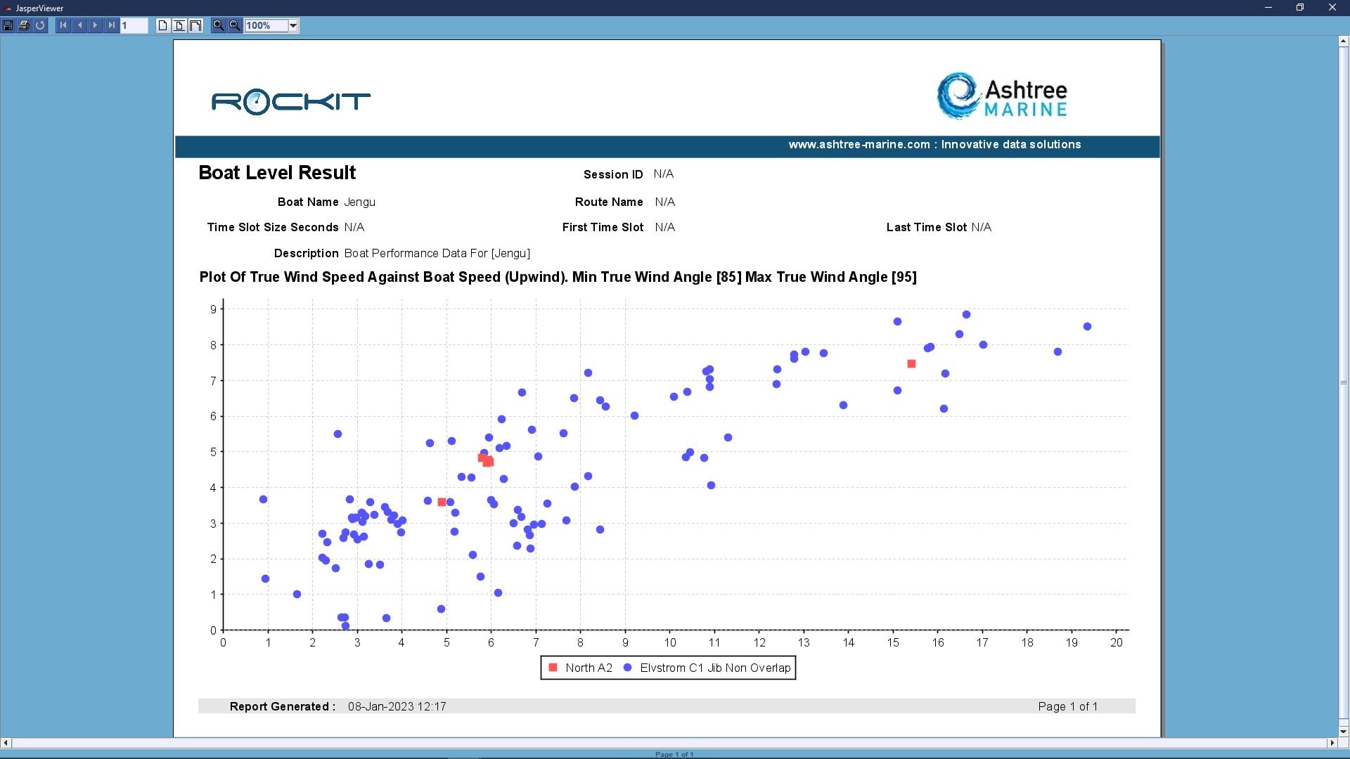
Printing Plots For Sail Data
There are a couple of options to print out the results of the analysis.
You can use the buttons on the left hand panel to print a PDF of the scatter chart.
This produces a report like the one on the right here. This gives you the option to either print the report to a file or export to a PDF.
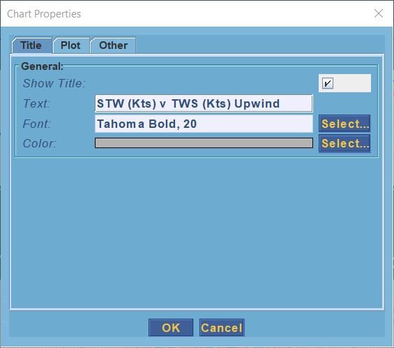
Alternatively if you right click on the actual graph you will get a context sensitive menu appear.
This gives you the option to both save the graph as a .png file, Zoom and and out on the graph axis and so forth.
It also gives you the option to modify the graphs visual properties; change the way that the graph is displayed. For instance; you can rotate the axis, change the font, background colour and so forth.
Its worth noting that the original properties will be restored when you update the sail plot the change in appearance is not stored for future use.